Saturday, November 19, 2011

Wedding Collage


After seeing this collage created by Connie Tumm, I immediately knew that I want to give something similar to my nephew and his wife. The wedding colors were purple and silver and the invitations were very similar to the DCWV metallic paper so that was my starting point for colors. The square to the right of the silhouette couple is a part of their invitation with their initials in it and I just added a small pearl accent in the center. I absolutely love how this turned out. There are so many elements that were used to create this I can't remember them all. The finished piece is framed in a black shadow box frame that I picked up at Michaels or Joann's. It came in a set of 3 frames. I couldn't get a good picture of it in the frame because of the glass.

Friday, November 18, 2011

Elegant Couple


My husband and I attended a wedding for our nephew last week and this was the card we gave the happy couple. The couple are both in the Navy and have been legally married since February 12th of this year but wanted to have a ceremony and reception with family and friends. They asked my husband to be the officiant and he happily obliged.

When I saw this Inkadinkado stamp set at Joann's I had to have it. I love the silhouette image of the couple. I began with a piece of perfect plum card stock measuring 9 1/2" x 6 1/2" and scored it at 4 3/4" to create a card measuring 4 3/4" x 6 1/2". I embossed some shimmery white card stock that measured 4 1/2" x 3 1/4" using the elegant lines embossing folder and another piece of shimmery white card stock that measured 4 1/2" x 3" using the dots embossing folder and layered them on pale plum card stock measuring 4 5/8" x 6 3/8". A length of white taffeta ribbon was tied around this layer and then adhered to the card base.

The image of the couple was stamped on shimmery white card stock in versa mark ink and embossed with black embossing powder. Once I had the couple stamped and embossed I centered the sentiment below that image and stamped and embossed that too. The couple image was layered on a piece of perfect plum card stock and adhered to the card base using dimensionals. I added some pearls to the circles on the elegant lines embossed image and added more sparkle to the bride's dress using frost white stickles.

Supplies Used: Paper: Shimmery White, Pale Plum, Perfect Plum; Stamps: Inkadinkado Wedding; Ink: Versa Mark; Other: Black Embossing Powder, Elegant Lines Embossing Folder, Dots Embossing Folder, White Taffeta Ribbon, Pearls, Frost White Stickles, Dimensionals

Thursday, November 17, 2011

Lucky You


This was the card I gave to a co-worker and friend of mine who recently celebrated his 52nd birthday. He enjoys going to the casino and I thought this card would be appropriate for him. A piece of Jackpot DSP was adhered to real red card stock and then adhered to the very vanilla card base. A strip of real red card stock had one edge punched using the pinking hearts border punch and a different strip of Jackpot DSP was layered onto the real red strip and then added to the card front. The dice were created using 1" squares of real red card stock adhered to 1 1/8" squares of black card stock. The dots on the dice were created from circles punched using the crop-a-dile and very vanilla card stock. The sentiments were stamped on very vanilla card stock in real red ink and layered on real red and black card stock then attached to the card front using dimensionals.

Supplies Used: Paper: Very Vanilla, Black, Real Red, Jackpot DSP; Ink: Real Red; Stamps: Afterthoughts, A Little Birdie Told Me; Other: Pinking Hearts Border Punch, Crop-a-Dile, Dimensionals

Wednesday, November 16, 2011

Confidence and Dreams


I saw this card on Splitcoaststampers which is what inspired this card for a co-worker of mine who completed her master's degree in May and moved to a new job in Philadelphia. The flip flop images were stamped in black ink on a strip of white card stock and colored using SU markers. The stamped images were layered on a strip of melon mambo card stock that had the top edge punched using the pinking hearts border punch. A strip of melon mambo pom pom trim was attached to the bottom edge using tombow multi-purpose adhesive. The sentiment was stamped on white card stock using bermuda bay ink and the word "direction" was stamped on a scrap piece of white card stock using melon mambo ink and layered on a piece of melon mambo card stock then attached to the main sentiment with a dimensional. The additional pair of flip flops were stamped, colored, cut out and adhered to a layer of black card stock to create a shadow effect. A circle was punched from melon mambo card stock using the crop-a-dile, attached to the flip flops and a pearl was added to the circles center.

Supplies Used: Paper: Whisper White, Black, Melon Mambo, Thoroughly Modern DSP; Ink: Black, Bermuda Bay, Melon Mambo; Stamps: Sunny Fun, Word Play; Other: Pinking Hearts Border Punch, Melon Mambo Pom Pom Trim, Pearls, Dimensionals

Tuesday, November 15, 2011

Fall Berries


Just a quick and simple fall birthday card. The image was stamped in black on very vanilla card stock, colored with markers and then the berries were highlighted with a white gel pen. The stamped image was adhered to a layer of peach parfait and then dusty durango. The dusty durango card stock was punched along one edge using a border punch. I kept the layout simple because I wanted the image to really stand out.

Supplies Used: Paper: Very Vanilla, Peach Parfait, Dusty Durango; Ink: Black, SU Markers; Stamps: Oh So Lovely, Teeny Tiny Wishes; Other: EK Success Parisian Border Punch, Word Window Punch, Modern Label Punch, White Gel Pen, Crystal Effects, Dimensionals

Saturday, November 5, 2011

Shabby Chic Flower


The challenge: A Costume Party - "disguise" yourself in a stamping style that is not your own.

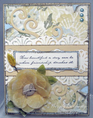
I've always liked the look of the shabby chic/vintage type cards but shabby chic is not my style and since it took me three days to complete this card that more than proved it to me. I really stepped out of my comfort zone for this challenge, guess that's why its called a challenge. All of the layers were distressed using the distressing tool that comes with the portable cutter from SU. Once I had all of the layers distressed I used crumb cake ink to give it more depth and to add to the distressed/worn look. The flower was created using vellum that was folded into multiple layers so it was easier to punch and I only had to punch out the flowers twice to give me enough layers. I used the fancy flower punch for the main flower and the 5 petal flower punch for the leaves. The flowers were inked with so saffron and the leaves were inked with old olive. Once the vellum was dry each piece was crumpled to give it a worn/aged look, layered and held together with a small brad. I tied a linen thread bow to the button and attached it to the flower using mini glue dots. Most of the cards that I've seen in the shabby chic style have some sort of lace or ribbon but I didn't have anything that looked right so I created my own lace look using some punches and very vanilla card stock. I started laying things out and felt that something was missing so I cut some swirls out of so saffron card stock using the scribbles/swirls die and added them to my layout until I was satisfied with how it looked and then I began adhering the elements together. The card base is a standard A2 card in so saffron card stock layered with bashful blue and Le Jardin DSP. The medallion chain (lace) was added to the top and bottom edges of so saffron card stock with the abstract flower chain (lace) layered on top. The sentiment was stamped in black ink on very vanilla card stock, layered on bashful blue card stock and attached with dimensionals and then the entire piece was attached to the card base. The swirls were glued under the lace edges and the flower was attached with dimensionals. I attached the leaf straight pin making sure that the sharp end was pierced through the dimensional and added the pearls.

Supplies Used: Paper: Very Vanilla, So Saffron, Bashful Blue, Le Jardin DSP, White Vellum; Ink: Black, So Saffron, Old Olive, Crumb Cake; Stamps: Ageless Adornment; Other: Fancy Flower Punch, 5 Petal Flower Punch, EK Success Medallion Chain and Abstract Flower Chain Punches, Sizzix Sizzlits Scribbles/Swirls Die, Distressing Tool, Linen Thread, Soft Subtles Button, Leaf Straight Pin, Pearls, Brad, Mini Glue Dots, Dimensionals

Friday, November 4, 2011

Christmas Lodge


The Challenge: Frilly Paper Ribbon

My ribbon isn't exactly frilly but it is made from paper. I used a strip of designer paper that I scored and folded to create pleats. There is a tutorial on splitcoast here. I used very vanilla and garden green card stock with the top note die and then stamped the sentiment in garden green ink on the very vanilla piece that had the edge trimmed from it. The stamped sentiment was then layered over the garden green top note die cut. The lodge was stamped in garden green ink on old olive card stock and then the top note sentiment was added. I attached the pleated paper ribbon and tied the metallic satin ribbon around the pleated paper adding a button so that I could tie a bow. The snow was highlighted with a Gelly Roll glitter pen for some added sparkle.


Supplies Used: Paper: Very Vanilla, Old Olive, Garden Green, DSP Unknown; Ink: Garden Green; Stamps: Christmas Lodge; Other: Top Note Die, Old Olive Button, Metallic Green Satin Ribbon, Gelly Roll Glitter Pen

Thursday, November 3, 2011

Essentials of Happiness


The challenge: Words of Encouragement - focal point should be a word, quote or sentiment of encouragement. I combined the HYCCT challenge with a sketch challenge for this card. I stamped the sentiment on very vanilla card stock in black ink and then colored the leaves and stem. The designer paper is called autumn traditions and of course it is now discontinued and it is also what I used to pick the colors from. I kept things very muted and didn't use the brighter red or purple. Once I had the card layout set it needed a little more color and that is why I decided to use the yellow gold ribbon.

Supplies Used: Paper: Very Vanilla, Sahara Sand, Always Artichoke, Autumn Traditions DSP; Ink: Black, River Rock, Mellow Moss, Always Artichoke; Stamps: Sidekick Sayings; Other: EK Success 3/8" Ribbon Border Punch, 1/4" Yellow Gold Grosgrain Ribbon, Square Lattice Embossing Folder, Dimensionals

Wednesday, November 2, 2011

Sparkly Pink Trees


The challenge: Create a Christmas/Winter/Holiday card using any shade of pink as one of the primary colors in your color scheme. I just recently bought this Christmas tree punch and decided to create some sparkly pink trees. No stamping on the card at all. This was a very quick and easy card.

Supplies Used: Paper: Whisper White, Regal Rose, DCWV Glitter Pack, Brenda Walton Peppermint Twist Mat Pad; Other: EK Success Christmas Tree Punch, Nestabilities Circle and Scallop Circle Dies, Scallop Border Punch, Snowflake Embossing Folder, Fantasy Rose Grosgrain Ribbon, Dimensionals